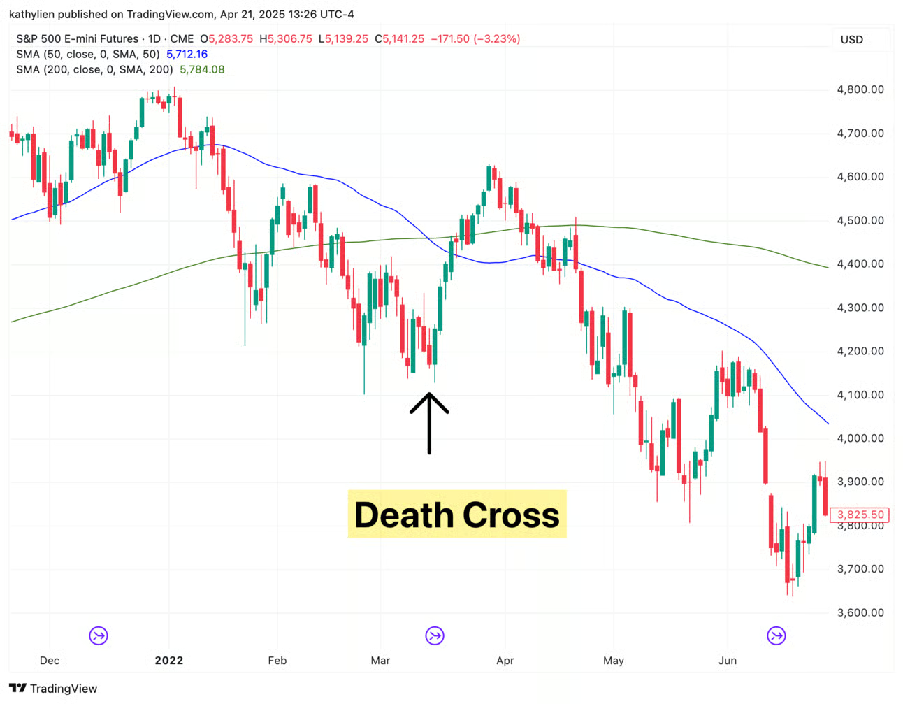
What Is a Death Cross?
What it really shows is that recent price action has been consistently underperforming long-term trends. But here’s where things get interesting: despite the name, a death cross doesn’t always precede a crash. In fact, historical data shows that markets—particularly the S&P 500 and Nasdaq—often experience a short-term rebound after the pattern appears. One well-known example saw the S&P mark a near-term bottom just after a death cross formed.

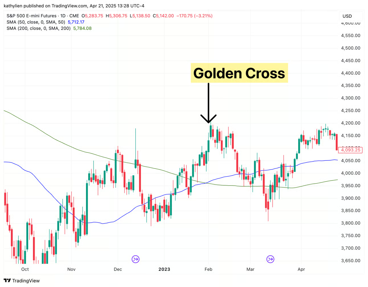
What About the Golden Cross?
The golden cross can indicate growing optimism and improving sentiment. But just like the death cross, it isn’t foolproof. Sometimes, a golden cross appears just as a rally is running out of steam. That’s why it’s important not to rely on these patterns alone. A golden cross might look bullish on the surface, but in some cases, it can signal exhaustion, not strength.

How to Use Them Effectively
A Unique Way to Trade the S&P
The death cross and golden cross are among the most watched chart signals for theS&P 500, making them especially relevant for traders looking to capture moves in major indices. Whether you're swing trading or looking for key trend shifts, patterns like these can offer great timing cues—when used correctly.
With platforms likeAxi Select, traders can use strategies like these to trade the S&P with real funding and no upfront evaluation fees. It’s one of the more interesting—and visually intuitive—ways to identify trend changes and make smarter, more confident trades.
So, the next time you see a cross forming on your chart, remember: it's not about fear or excitement—it’s about reading the market with clarity.


